


Design a Form that Reduces the Filling Work

This freelance project that I did for the client is focusing on a simple task-redesigning the scheduling form of a thermostat.
The client's company is building a thermostat control system for commercial settings (Such as warehouses, greenhouses, and occasionally churches.)
Each client needs a unique set of temperatures to accommodate their business. For example, a greenhouse needs constant 18° and 60% humidity 24/7, whereas churches only need to keep at 21° when there are events.
The scheduling form is to help clients set up when and what temperature their property to be.
Essentially, the form is a crucial part to set up clients' business.

Problem with the old design
The form originally had a structure, it's just not that well-UXed.
For example, the start of the form begins by giving users(normally a location manager) a very general whiteboard to start from. (The form did provide templates, but for first-time users, it's not giving much information.)
So as some customers said in the user interview, they sensed "Something's weird" but were not quite sure where and why.
I was brought to this project to make changes to the form so it's more user friendly by the company's CEO.
I want to design the experience for this form so that users won't have to "design the form" themselves.
Improvements
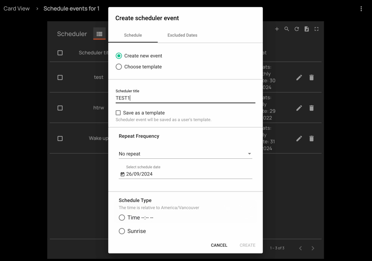
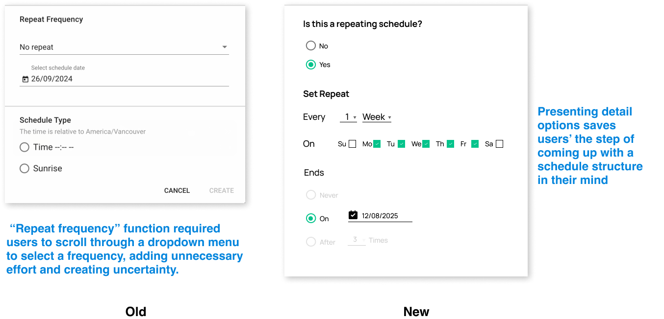
On the old form, creating a new form is selected by checking the "Create new event". User can choose "Templates" they saved previously, but there were not much of a guidance at this step.

This potentially creates frustration for the clients since they have no idea what's to expect for the next step, to make this experience better,
I expand the choice by providing 2 more precise worded options.
This came from listening to user interviews and understanding different types of users. Even when controlling different venues, 2 patterns appear in use cases.
In the first case, the user wants their fan and thermostat to be always "On" until something comes up, normally it's maintenance or some unexpected events, for this type of use case, the schedule they set up is constant without a specific end time.
In the second case, users are considering an event(one-time and recurring ), it's usually when the venue is hosting for a group of people, or set up holiday mode when no one is in the office. In this case, the thermostat only needs to operate for some time, the schedule needs to allow for an end time.
Thus, by providing these 2 options, the form is already
Helping the user get into the mindset of the schedule.
Also delivers an important message: the form knows the user's behavior and has the capability (though hidden) to help the user's goal.
The rest of the redesign followed the logic in part 1- giving the user a framework to work with by adding more content based on user interviews.
For example:
Having learned more about user's needs, I understand that most users want their thermostat running on weekdays.
So I show that in the default for them, also provide them with a full set of capabilities to do any other kinds of scheduling.
Or:
The old form did some problem solving work-realizing that temperatures are not always related to chronological but rather solar time, hence it provides an option to select "Sunrise" or "Sunset".
In the version that I designed,
I added more details to the option, including indicating the time zone so there's no confusion.

Also, from the visual side,
I replaced some outdated interactions with patterns that align more with industry standards.

Takeaways
Reducing cognitive load is good for keeping the user in the long run
Some kind of cognitive load would inevitably be given to users - but it would be a balancing act, products need to put enough load for user to get engaged but not too much so that they get irritated. Especially in more task-orientated products.
When a product's cognitive load is higher than its value, it would cause Churn and loss customers.
By reducing cognitive load I foster customers' trust over time and make them more dependent on products to do task because it's much load to do on their own.

Impression management for the product
In this project, my client's team already did decent amount of user interview to understand its user, but the product it's not reflecting the workload.
When designing this form, I'm implanting these knowledge of clients on the surface of the product.
This gives the impression of "Hey, we've done some work studying you, and we have this product that knows your pattern and fits your needs."
Through this strategic disclosure, the product would give off a very tentative and knowledgeable impression to the clients.